Project
Santa Chiara Lab is the University of Siena's centre for open innovation and sustainability: website, logo redesign, visual and verbal identity, copywriting.
Santa Chiara Lab: digital communication and web development for the University of Siena
- Client
- University of Siena
- Area
- Identity, Development, Relations
- Year
- 2019-2024
- Main link
- Go to the website
Santa Chiara Lab is the University of Siena's centre for developing and promoting sustainable solutions through open innovation. It brings the humanities, social sciences and life sciences into contact with new technologies. It hosts research, innovation and training on sustainability, agri-food, digital transformation, health and soft skills.
Since 2019 Dinamo has worked continuously with the centre on projects covering visual identity, content, websites and graphic design.
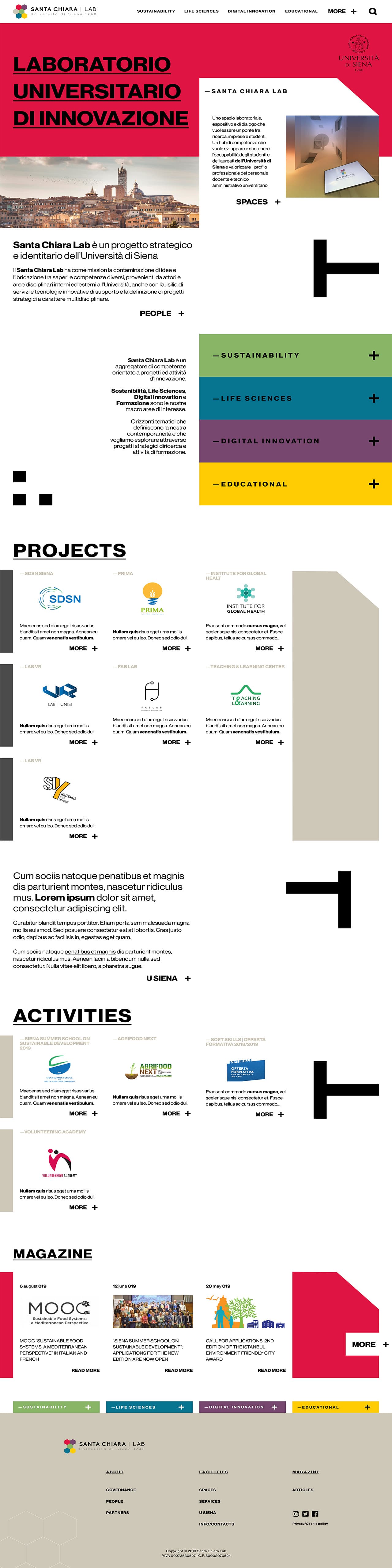
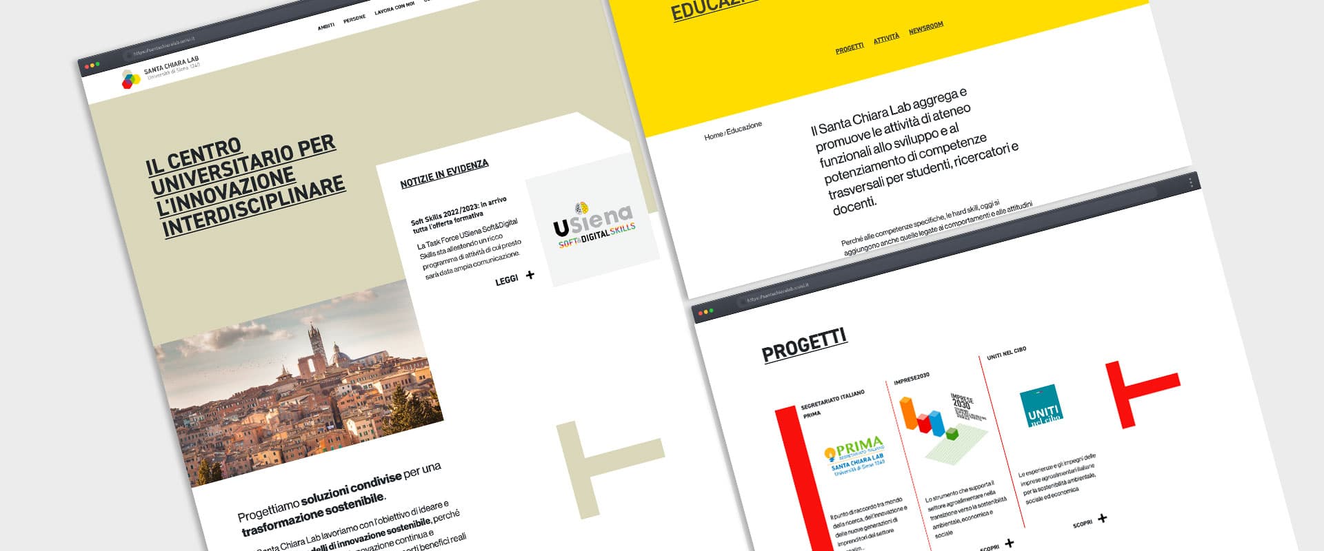
In 2020 Dinamo designed and developed the new website, taking account both of the polyphony of voices in the centre and of its unified character.
Its commitment to sustainable innovation between business and the university world was translated into a strongly identifying visual design. The many layers of information were rationalised into a matrix navigation by thematic area, project, activity and blog article.
There were two objectives: to make the information consistent, and to give each strategic project a way of entering content that would not create imbalances.
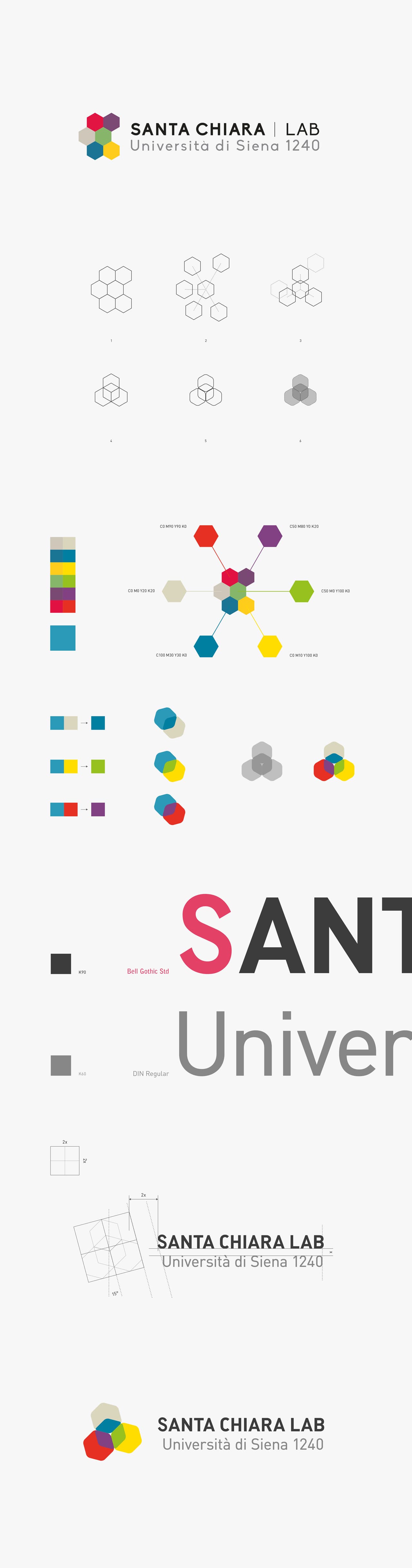
In autumn 2020 Dinamo worked on the centre's visual and verbal identity, to bring the value proposition of its many strands into focus.
The outputs were a renewed version of the logo and new text content distributed across the website and the company profile. Upstream there had been a strategic analysis with an internal working group and three co-design sessions, closed by a shared guiding document.
Intervening on an existing and well-liked logo is delicate. It had to evolve without losing the traces of the previous identity. The historic logo offered a multicoloured honeycomb structure, which was deconstructed and reassembled into a pattern of rounded hexagons in three dimensions.
With overlaid colour, the pattern reads as both a three-dimensional and a two-dimensional symbol. The result develops the earlier mark without losing its identifying features, the interaction of forms and colours standing for the interdisciplinary character of the centre.