Project
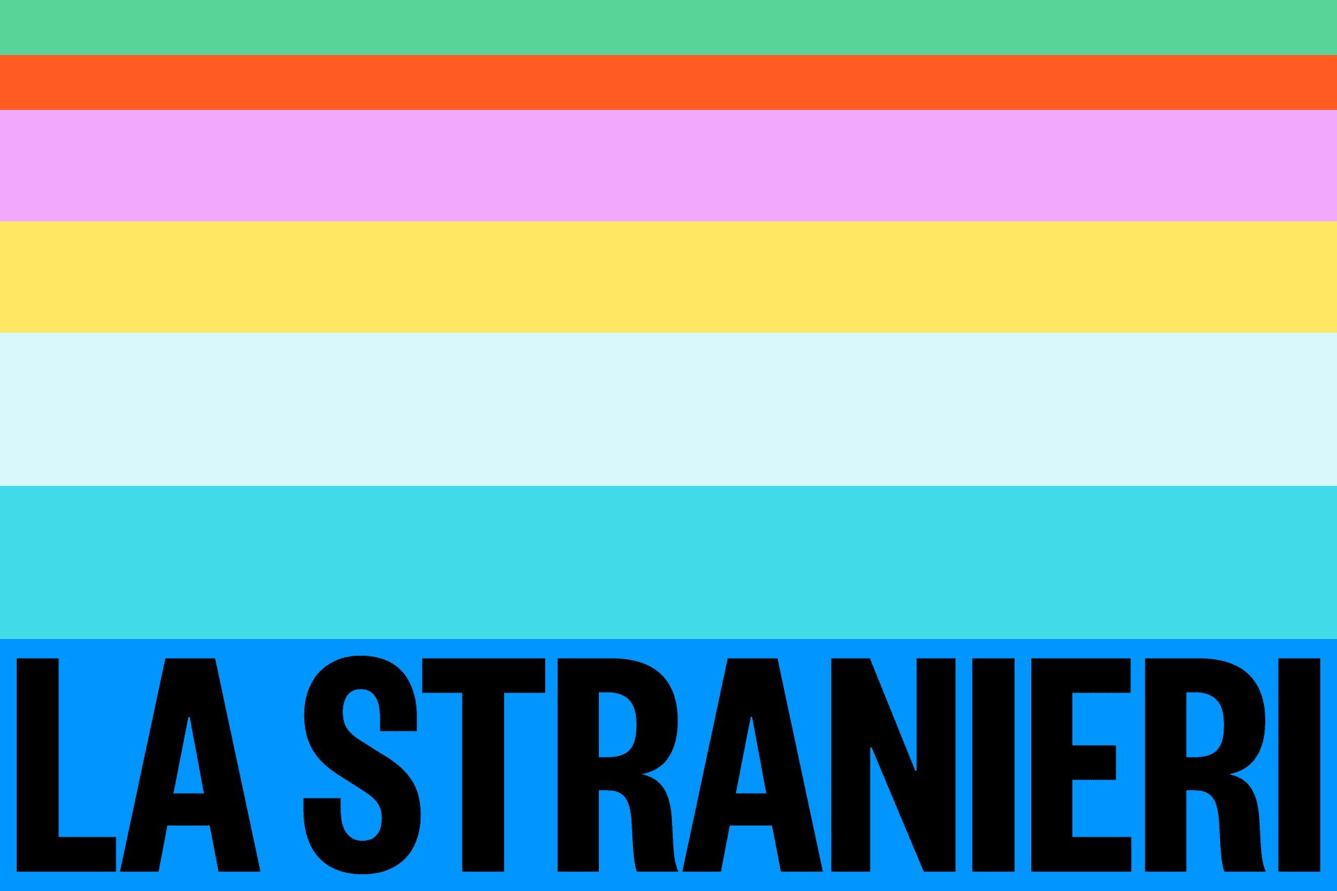
A new visual system that works by addition to the institutional logo: it grows around it with a shared grammar.
Rebranding the University for Foreigners of Siena

- Area
- Identity
- Year
- 2025/2026
- Main link
- Download the manual
The starting point for this university's rebranding was a constraint to be turned into an opportunity: the institutional logo works and is not to be touched. The project turned that into a working principle, producing a visual system that adds to the existing identity and gives it a common grammar for all the communication growing around it: posters, social posts, slides, student guidance materials.
We worked with the Rector's Delegates for Communication and the University's Communication Group. Rather than validating the system on abstract mock-ups alone, we tested it by redesigning posters and brochures that had already been produced: real materials, with their own constraints of text and content.
A visual language made to be reused, format after format. Already in daily use in the University's communication.
The typographic choices
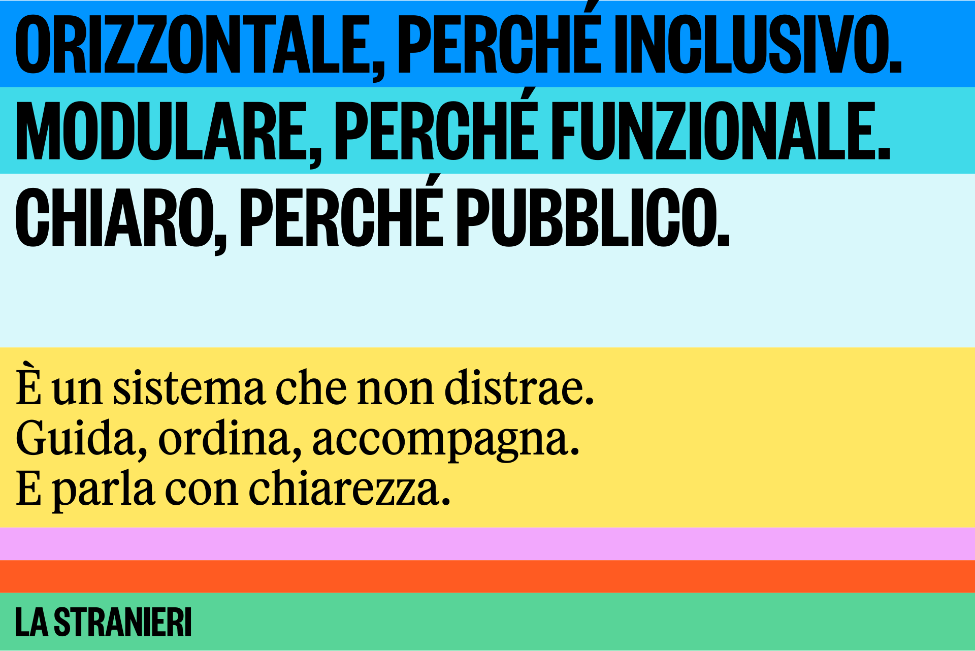
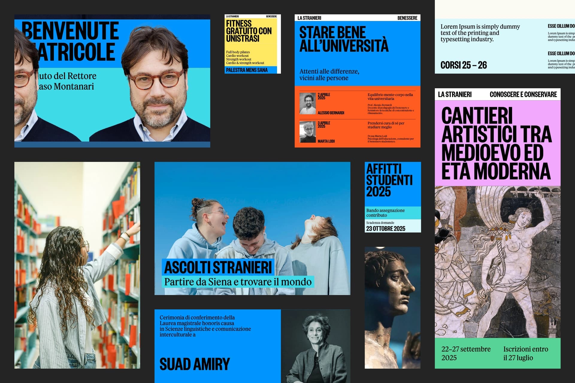
The pairing gives the University an editorial voice. For headlines, Founders Grotesk X-Condensed by Klim Type Foundry: a grotesque drawn for large sizes, condensed and warm in its drawing, which takes the University's long names on a single line and keeps its presence at large sizes.
For body text, Feature Text by Commercial Type, the contemporary serif created for the New York Times magazine: built for sustained reading and for a register that suits a university of languages and cultures. In Office environments, where most internal materials are produced, two Google fallbacks chosen for their close proportions and tone.
The colour system works on two blues with distinct roles. The institutional blue, dark and restrained, stays reserved for official communication. Beside it, a brighter primary blue becomes the load-bearing colour of the extended system: the tone that makes everyday materials recognisable.
From this follows a rule of quantity. Institutional communication uses only the two blues; extended communication may add up to two accents, within a maximum of three colours per piece. The accents are saturated and lively, in shades of pink, cyan, green, orange and yellow, and bring energy to posters and social posts while keeping the system together.
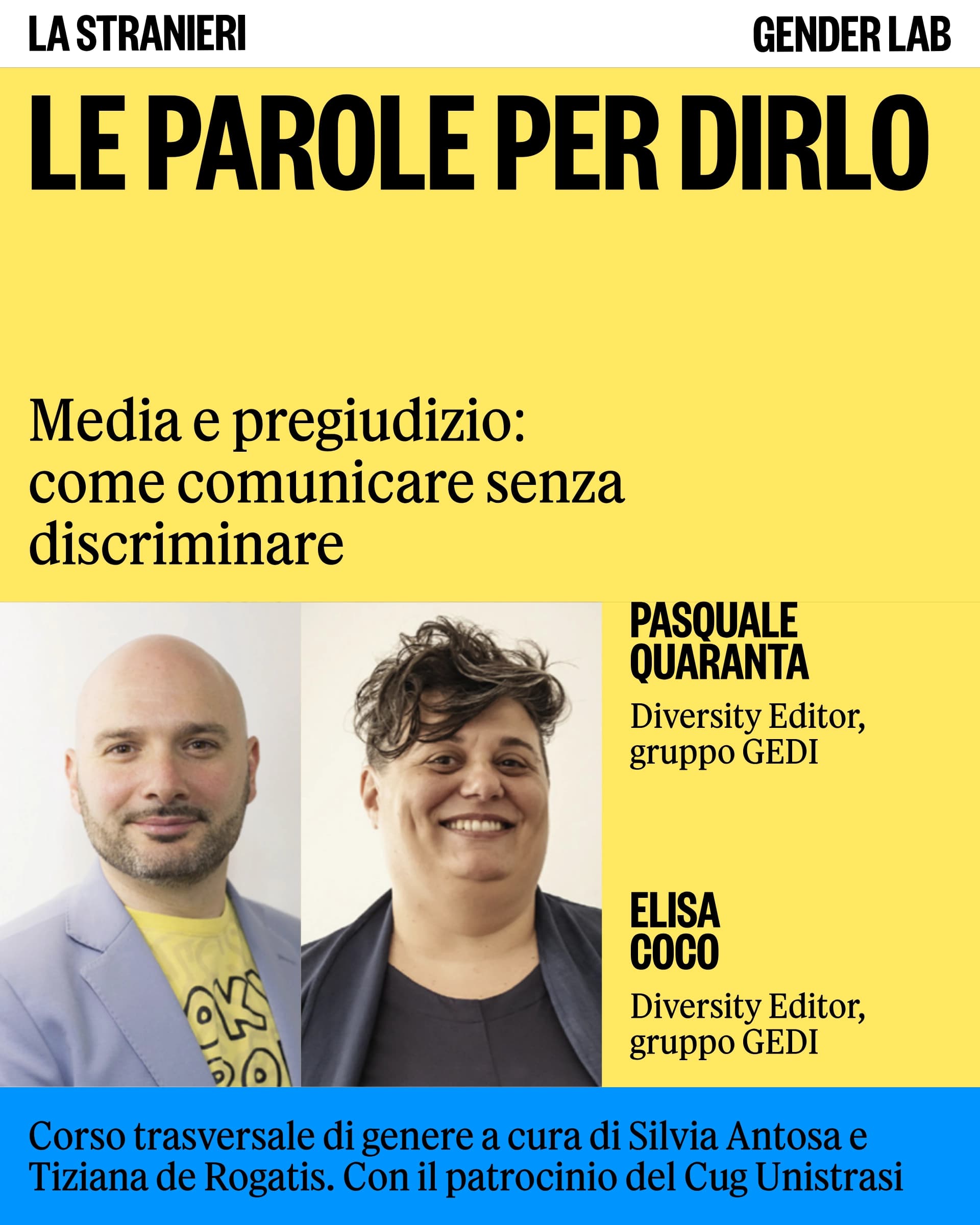
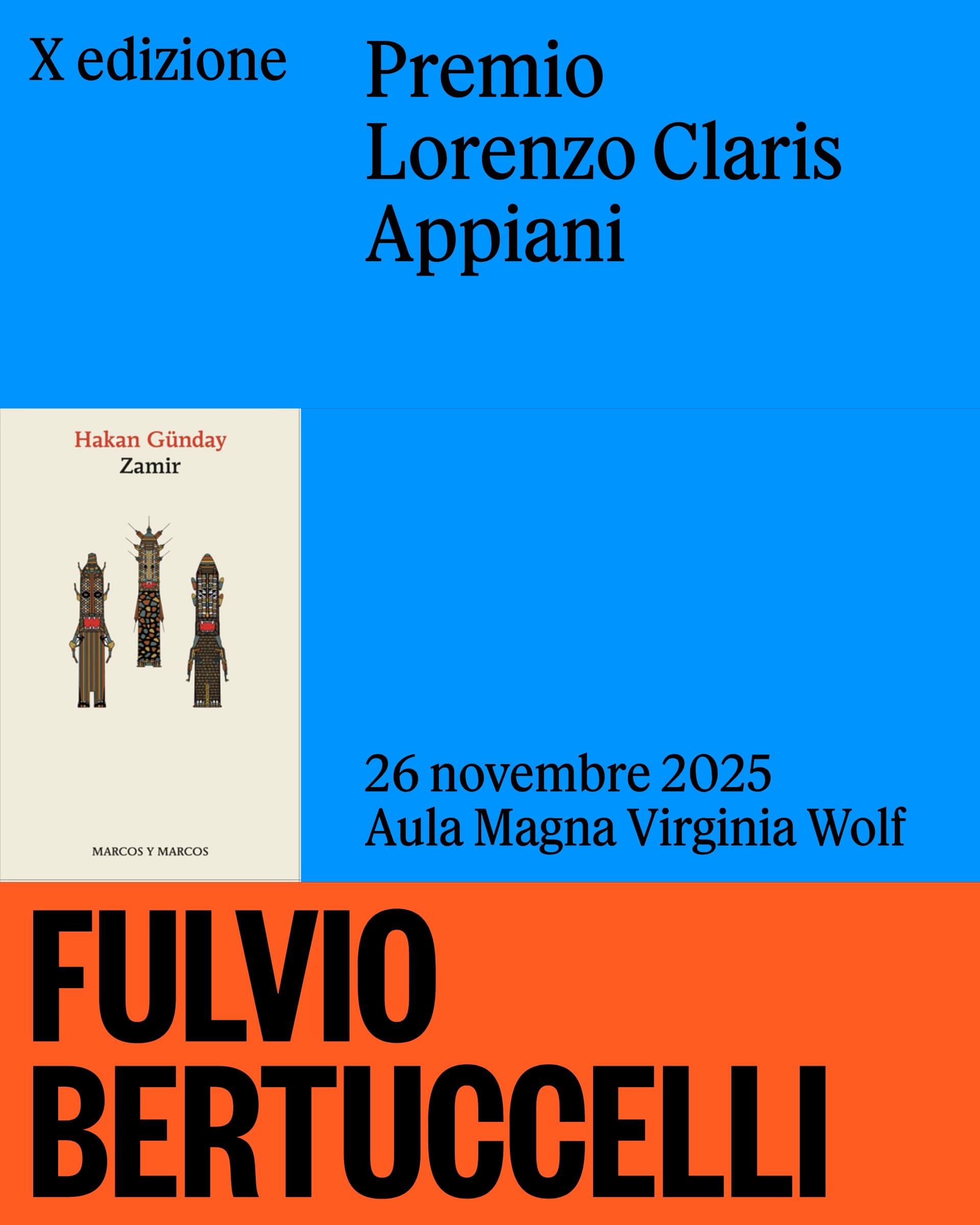
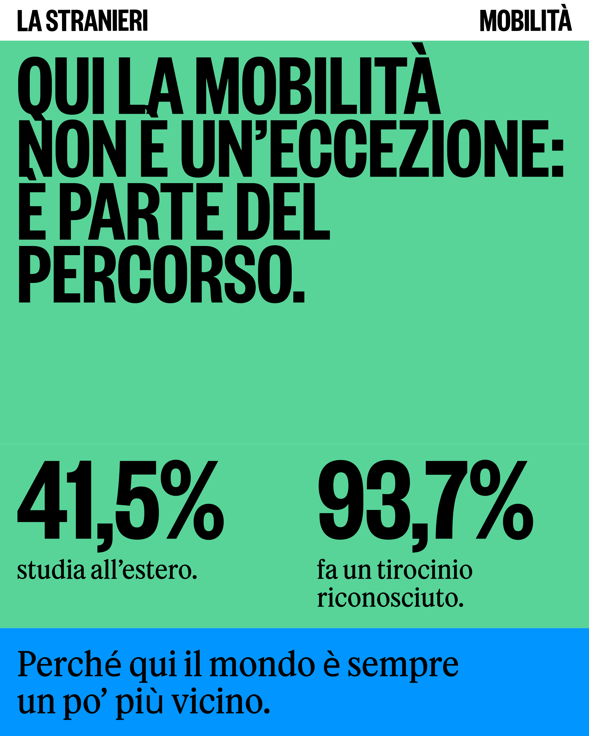
The underlying principle is reuse. The system is made of a few repeatable components.
Horizontal bands (blocks of colour or photographic blocks, at least two per piece), white frames, stickers for secondary information, which recombine and vary instead of being redrawn each time. Holding them together is the grid: the height of the format is divided into 21 equal parts, the base module is 1/21 and every band is a multiple of it. The proportions always resolve and the elements lock together predictably on any format, from the poster to the social post.
All of this is designed for whoever picks the project up. The communication office, or a designer arriving later, recombines and varies the existing components and gets coherent materials without having to reinterpret the system. Maximum reuse is the condition that makes it possible to maintain the identity in-house, day by day.
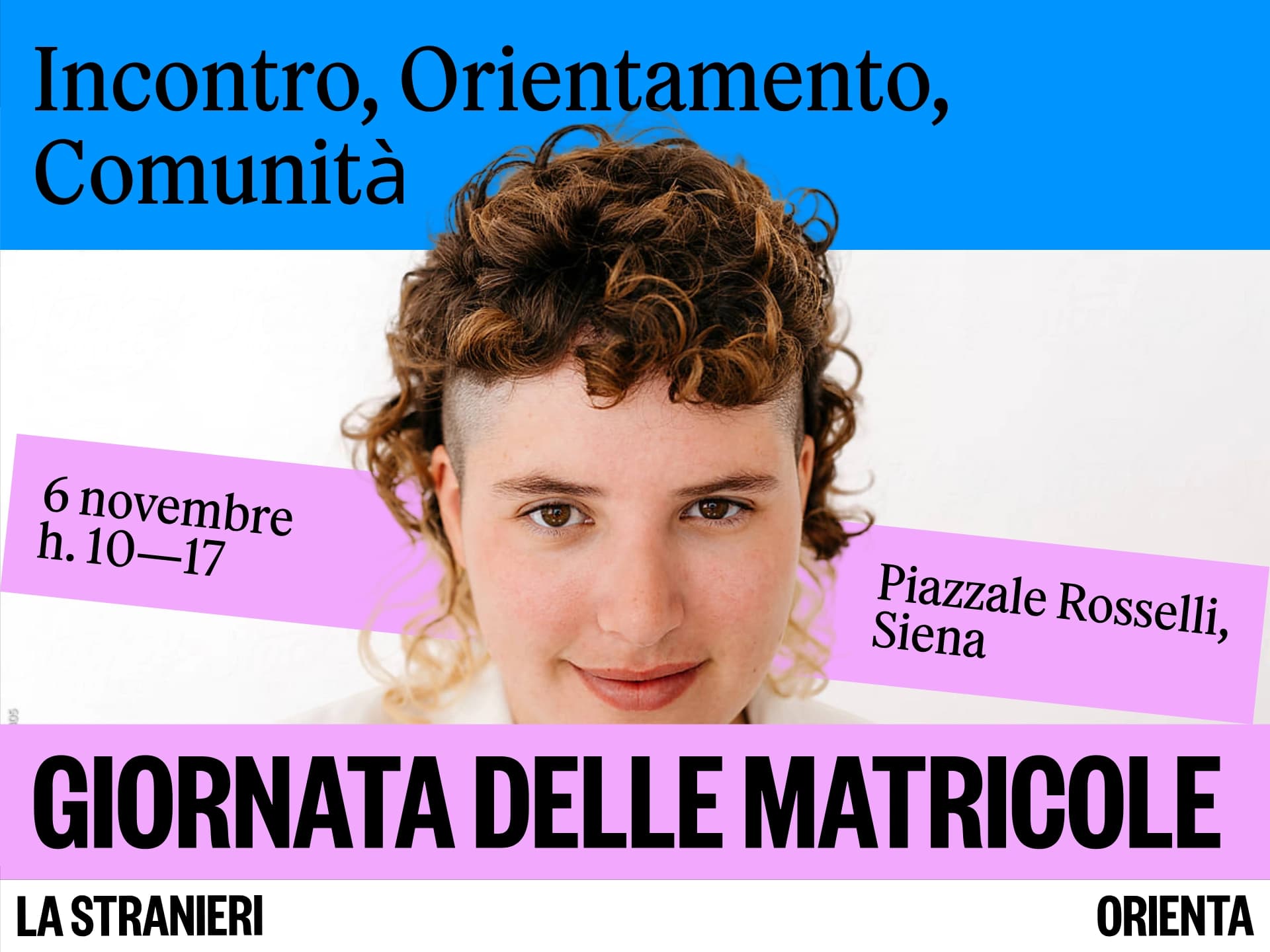
Adopting the guidelines
The manual covers nine areas, from print to social. To make daily use easier it includes Google fallbacks for Office environments and a simplified PowerPoint template, tools designed for the people producing materials every day, not only for designers. Since January 2026 the system has been in constant use: the University's Instagram profile shows a continuous sequence of posts consistent in layout, typefaces and colour. Its adoption in the first months of 2026 is the most direct check that the system works in day-to-day production.